SIMPLY MEASURED
From excel to excellence
I started my career as a designer creating analytic reports for Simply Measured. Originally these reports were designed and built in Excel and we were tasked with maintaining most measures and calculations as well as storytelling and design. As Simply Measured acquired new technology and grew as a business I was promoted to the Product Designer for the company in charge of a series of important redesigns and new initiatives.
-
I was tasked with over hauling our Social Media Advertising Reporting into a unified Dashboard approach. I enjoy including one of my first whiteboard sketches in this group because sometimes a core idea makes it all the way through the process. That said this design is a classic example of our first few passes incorrectly implemented our older patterns without identifying where the market had moved to. Once we started reaching out to informed customers we realized we needed to rethink our approach. I was able to convince our Product Owners that we needed to return to the drawing board and create a more modern and technically complex solution. Once we turned around these designs our partners we very happy with this approach and told us “We wouldn’t have to login to Facebook ever again” if we took this approach. I believe the Product was developed and shipped after the Sprout acquisition and sold as a high end offering in their product portfolio.


-
Simply Measured acquired a small start-up with some interesting technology that allowed for tracking what at the time was called Dark Social. This allowed companies to track fully unique links that were shared via blind technology like SMS, chat, and email. Thus allowing companies to better understand “Direct” inbound links. Social Media at the time struggled with Attribution and showing efficacy. How can you tell the effect of your social campaigns on real world outcomes. We developed a complete ground up revolution of the product that not only showed traditional Social Media metrics but overlayed link attribution to your social posts. This was a very complex redesign of the product from the ground up. It was launched at our yearly convention and was at the time unlike anything anyone was doing. The product itself was akin to a small Google Analytics suite of reporting in scope. This project marked the first time Simply Measured moved away from excel as the core platform for reporting as well as me stepping into the Product Designer role.


-
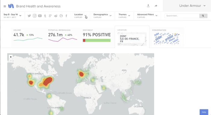
Simply Measured made a second acquisition of Data Rank, a scrappy and powerful Social Listening tool out of Arkansas. Social Listening is where you query the public social media landscape listening for key terms. Usually listening for Brand or campaign terms to manage overall Brand Health or Campaign volume respectively. PR and Crisis firms can also use these in times of important events to monitor messaging and the spread of different narratives. es here
-
Data Rank’s underlying technology was powerful and their interfaces were bootstrapped and off-brand. Another issue was for years Simply Measured ran our own Social Listening tools in our Excel suite of reports. The challenge was to develop a suite of tools that worked with our new product designs and leveraged the underlying power of Data Rank’s listening.


-
A suite of tools that allowed users to drill down from high-level aggregate metrics visualizations to post-level views to quickly identify trends and influencers on their selected topics. I was proud of how usable the live word cloud was for diving into the data. Also, the Hero Metrics at the top of the individual tabs answered the “why should I click on this” question. They even updated live in response to filter changes.


-
For years we knew we wanted to let users tag their posts with custom labels. This would open a myriad of custom reporting options to the customer. Campaign tags, post tone or style, author, once we had that information in the system we could apply it as a filter and a slicer to any report in the system. Once we moved to the new UI and second-generation dashboards we were able to create a Content Label design. I am very proud to say I pushed hard to allow users to customize the color of the individual labels in their settings, something with zero consequences on the data. Most product owners and engineers understandably thought of this as extra cruft. Luckily, our users loved the option and found it very helpful in the laborious process of labeling their content. This taught me a lesson about how data products have to balance the display of data and ease of data entry.


-
Myself and my design partner were tasked with standardizing the look and feel of 50+ reports originally made by seven different analysts in siloed excel files. Not only did we have to creat standards that would apply to all of this content but we needed it to work in old and fragile excel dashboards that used very simple graphs and shapes, no smart charts, no pivots, nothing more moderns than about 2003.


